

Today was about design exploration, not execution. As per usual, my goals were a little hazy. I wanted to, at least, make the logo (which would also sit in as the favicon), and two social media icons—not a very monumental task cumulatively. The first order of business, however, was getting the remainder of the site in line with the rough layout from earlier. That proved to be far more difficult than I’d anticipated. I know I ranted about WordPress in my proposal, but oh-my-goodness-gracious-me it is not fun to use. You often just want an item to be moved to the left, but because everything is tied together behind the scenes in hundreds of lines of HTML and CSS, it simply isn’t that simple. I found the workflow of going from Photoshop, an easy and free-moving canvas of pixels, to a mostly rigid mosaic of boxes to be very disheartening. Regardless, I made it work, even though it made a considerable dent in my willpower.
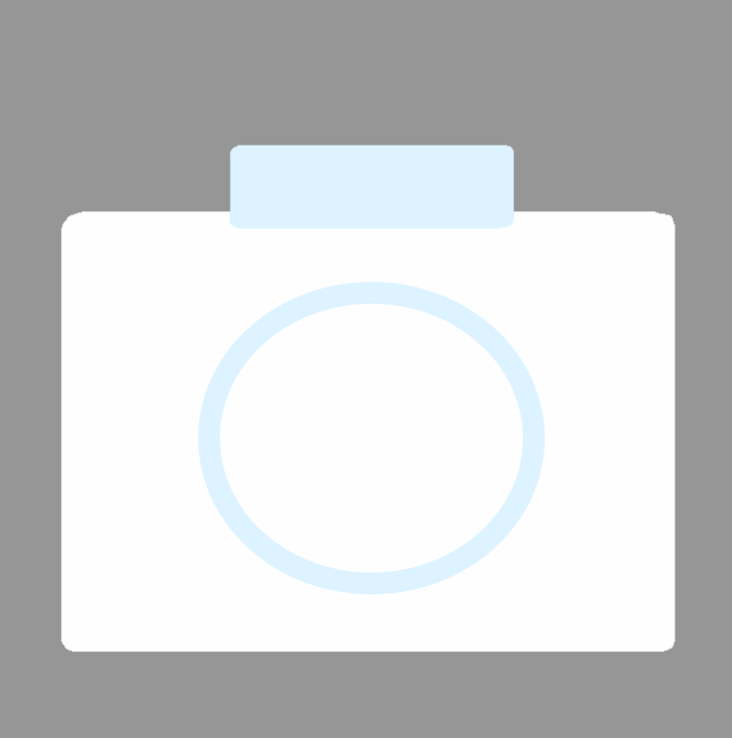
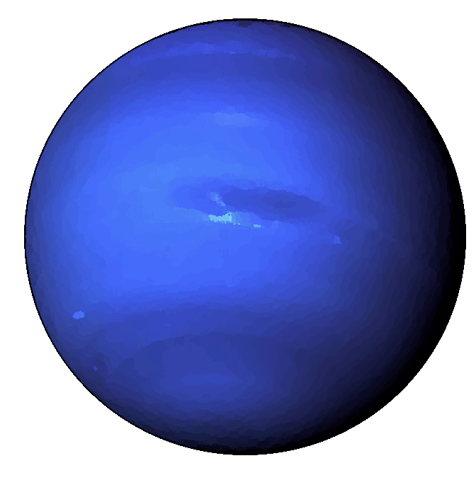
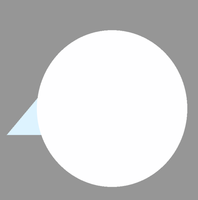
and… the images. (not impressive I’m aware)
Again, these are explorations. I wanted things to fit the minimalist aesthetic, but still be readable, functional. The camera is for Instagram, as per their own design language; the circle is less obvious and probably due for a rework. It’s supposed to be Twitter (which is now X, but I will never call it that.), but I don’t think the boderline Picasso-esque bird gets that idea across. My thought process was, what’s the least amount of shapes I can use and still convey the idea of a bird? That’s the result. Is it good? I don’t know, you tell me. Did you think it was a bird upon first glance? For the favicon, I wanted to keep Neptune as the central piece of iconography, stylize it. I’m terrible at vector graphics, so I decided to simply run it through some of Photoshops built in filters to get a more cartoonish look. It didn’t really work. The details are less defined, sure, but it’s still quite obvious that it was a photograph at some point. I’m just going to bite the bullet and really try to make my own version of Neptune from scratch, hoping to match the low-shape design of the other icons. The vast, vast majority of this work was simply me just faffing around in Photoshop putting shapes together. My process was as simple as it sounds.
That’s all, really. My website is designed with the intent of not having much of anything on it, so there isn’t much of anything to show. These designs will be further refined for clarity, and dialed to feel professional. Once that’s done, I can move onto organizing the site’s layout so it’s as effective as I envision.