
No breakthroughs, just completed work. What began as a simple endeavour to rid my site of fluff became a battle with the very tools that we’re supposed to be helping me. I will not claim to be learned in the ways of WordPress, but great-googly-moogly was this whole thing needlessly difficult. I’d say I achieved my vision regardless, but I lost a part of me along the way. That part should hopefully be visible in the site you’re reading this on. I like it, and that’s probably the most important thing. I wanted minimalism, and I have just that. As I’ve stated in my previous posts, nothing here was breaking any new ground skill-wise. I know how to do most of this, and that’s not arrogance speaking; I’m perpetually online—you just pick these things up. The creation of the assets went about as smoothly as I expected, but WordPress did exactly what I’d described it would. It’s getting easier, but not fun. I’m not sure it’ll ever be fun. I make this sound horrible. It isn’t. My complaints lay with the horrid UI philosophies of anyone working at WordPress. This project, these posts, that’s fun. I’m hoping it’ll smooth out.
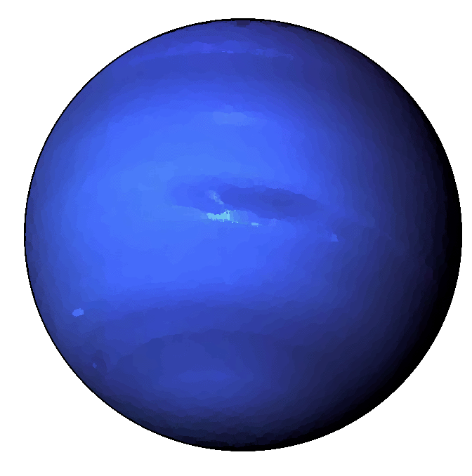
On the whole, there isn’t much left to do. I don’t want to busy-it-up more than need-be. I still need to work through my “about” section, get that formatted, and clean up the current temporary graphics. After that, I think I’m tentatively done. I’m curious to see what my peers have said in their reviews, because that will legitimately be quite helpful. When designing in a vaccuum, my aesthetic choices seem the “right” ones. From what I can see, minimalism, at least in the way I’ve portrayed it, does not seem the popular choice. I respect that, a lot, actually. They have a lot more personality shining through, and that makes it feel more personal. Does the drab white of mine reflect a lacking personality? That’s not what I was going for, but I fear that’s how it now comes across. We’ll see, I suppose—food for thought. I still stand by my initial design philosophy, but perhaps I could find a way to inject some personality into the images I create. I went with blue for Neptune’s sake, but that isn’t a color I’m extradordinarily fond of. Something off-kilter, maybe? A brown with white text? This has become far more reflective than I thought it would; back to experimenting, then.