

My options are twofold: elegant or blocky. These two stylistic identities are worlds apart, yet both hold equal appeal in my eyes. The lock screen of my phone, for instance, is one of my favorite photographs headlined by the time in a classical font. It’s minimalist, but has a certain poise about it. On the contrary, the duotone or tritone color palettes, thick letters, and rounded corners of social sites like Twitter also appeal to me in aesthetics. For the purposes of this excerise, I’m doing to do a study on the former in hopes of solidifying a cohesive vision for the remainder of the site. If I don’t like it by the end, then I’ll follow through with the latter:
I didn’t like it…
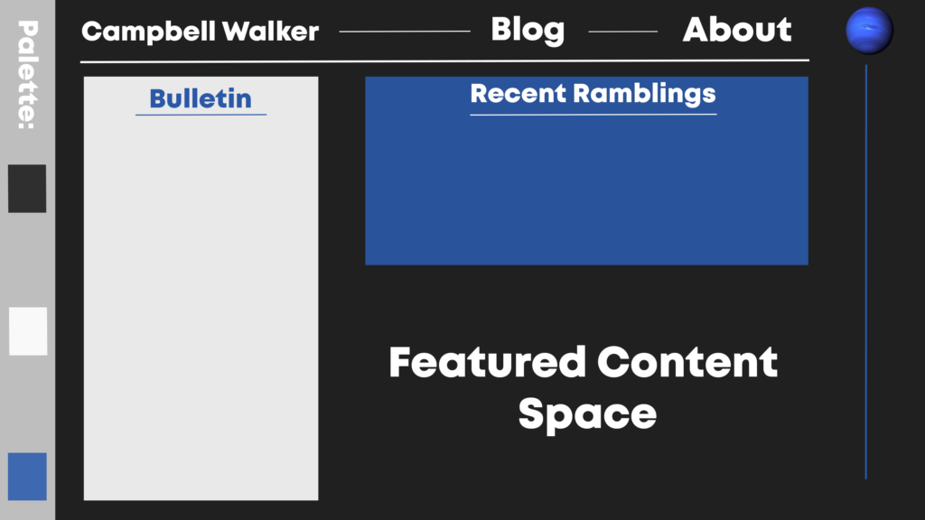
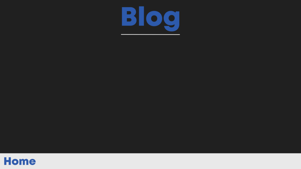
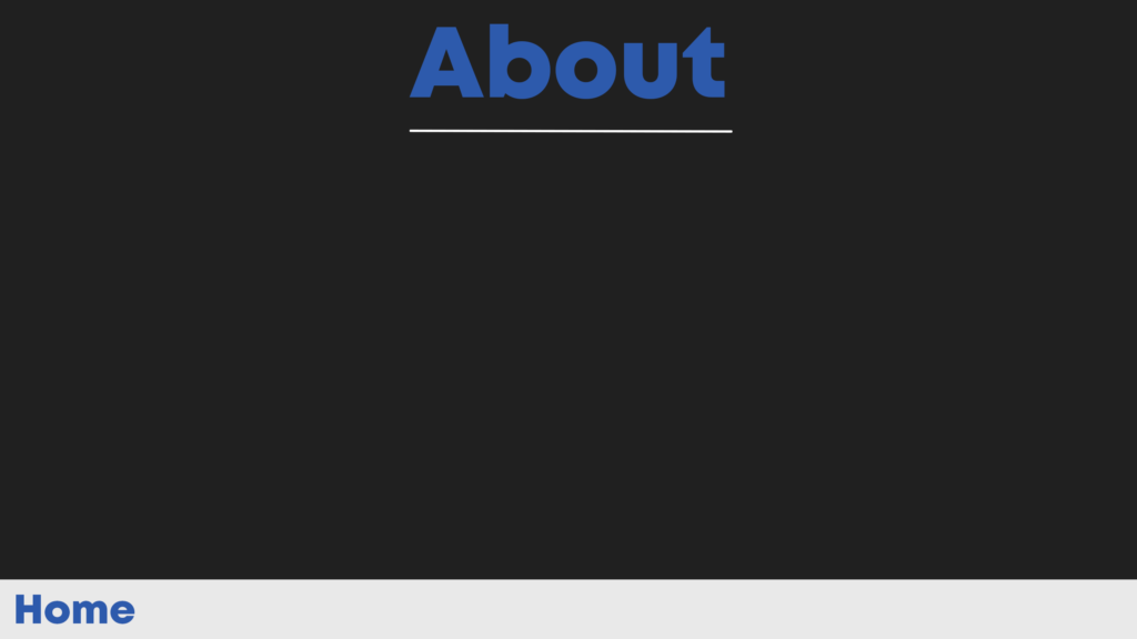
Turns out the other style was a tad too cluttered for my liking; thus, I went for the complete polar opposite. I could see how this could come off as merely laziness, but I genuienly want a no-frills design. A few buttons, neat sections, and all the information you’d need, all in one place. I picked the above color palette and just blocked out a few things out in Photoshop. It’s not refined, at all, whatsoever; the corners aren’t even rounded. Graphics-wise, I’d like to design a toonified version of the neptune favicon and logo, as well as few simple geometric graphics to spruce up the pages a little.